Thursday, December 15, 2011

hooray for the holiday fair!

Thanks to everyone who made it out to the annual SF Center for the Book Holiday Fair! Nibby Press was well received by shoppers and vendors alike, and I'm thrilled about it all!
cl_holiday-sliv.jpg

This is only my second time attending the Holiday Fair (or any craft fair for that matter), and again I've learned so much about... so much. The best part about craft fairs is meeting customers, talking letterpress and hearing their feedback. It's such a valuable experience, thanks again for coming and supporting Nibby Press!

cl_table.jpg

A very special thank you to my brother, my sister and her friend Amy for coming down to support me! My favorite part of the whole event was watching my brother, the ultimate salesman, push Hubble cards. It was awesome.

cl_siblings2.jpg


Thursday, October 20, 2011

obsession.


While reading the lovely Design Sponge today, I was reminded of the intriguing style of one of my all-time favorite films:


The Royal Tenenbaums.


The Zebras pattern above is the gorgeous design of Scalamandre, the incomparable interior design house. It's also used in the house on Archer Ave:


I love it with all my heart. The pattern comes in different colors and zebra orientation, but I love this one the most. It's rich and luxurious while remaining playful. I would smile ear-to-ear everytime I walked into a room lined with this beautiful paper.

Wednesday, September 14, 2011

experiments in printing ::: the split fountain

As of late I've only been interested in printing improvisationally. That is, I don't really plan ahead and everything from the design to color, just emerges on-press. I'm pretty sure it's a response to art school (still), which required precision and measuring. Now I just can't bare to do such a thing, and I often go to press with nothing but some blank paper and a notion. This process has proven to be successful in many cases, revealing some new techniques and tricks to add to my repertoire.

One of which is the good ol' fashion split fountain (or rainbow roll), which is the method of putting two ink colors on press at the same time. The technique can easily look ho-hum and overdone, but I've managed to get lucky with some of my color combinations, and I think I've really honed my split fountain skills. As you peruse the new line of cards by Nibby Press, you'll immediately see how obsessive I've become with the technique.

It all started with my 'Hubble' collection. Inspired by a bathing suit I slapped gunmetal gray on press with a yellowey chartreuse. It was breathtaking, and I rerouted Nibby Press' mission. Split fountain, ho!

A sampling of our split fountain work:

tequilla_split.jpg
Tequila Sunrise split
cl-tequilla_card.jpg
Tequila Sunrise card

tourmaline_split.jpg
Tourmaline split
cl-tourmaline_book.jpg
Tourmaline card

gray-blue_split.jpg
Nibby Press business card split
nibbybc-grbl-split.jpg
Our business card!

I had a fun time printing our business cards! It was an idea that I wasn't sure would work, but I'm pleased with the results of the fine detail, and the color shift. The idea will evolve with each new run of cards, and I'll refine coverage and impression and maybe change color. It's all very experimental.

::: end transmission:::

Wednesday, September 7, 2011

legend of the scotch egg.

lacocina_postcard.jpg
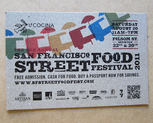
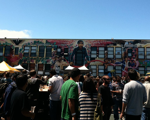
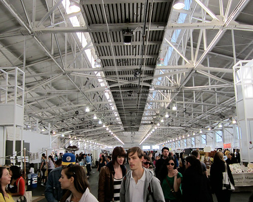
Just a few weeks ago was the Third Annual La Cocina Street Food Festival, a glorious event that takes place on Folsom Street down here in The Mission neighborhood of San Francisco. For those of you who are unfamiliar, La Cocina is a non-profit organization that incubates food entrepreneurs, allowing small food businesses to rent commercial-grade kitchen space. The Street Food Festival gives the public a chance to meet most of the food businesses cultivated by La Cocina, as well as showcasing established fine-dining restaurants in a casual festival atmosphere.

What I love most about the La Cocina Festival is the consistent price point—each booth offers a $3 Small Bite, an $8 Big Bite and a $3 Beverage (or something close). It's an incredibly easy and affordable way to try a variety of inventive dishes.

Last year felt somewhat like a competitive eating event with the crowds and all, but this year was a bit more organized and relaxed. I intended to eat a lot of food, that goes without saying, but just one dish was my priority.

The Scotch Egg.
stoked-scotchegg.jpg
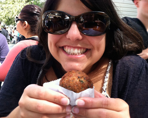
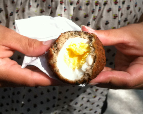
Oh! The delicious Scotch Egg! I was lucky enough to share one of these gems at the festival last year, and it plagued my mind ever since. Check this out: it's a hardboiled egg encased in sausage and then deep-fried. At first bite, it was like the heavens opened up just for that moment, and God patted me on the tummy. Needless to say, it was the first course.
YUM.jpg
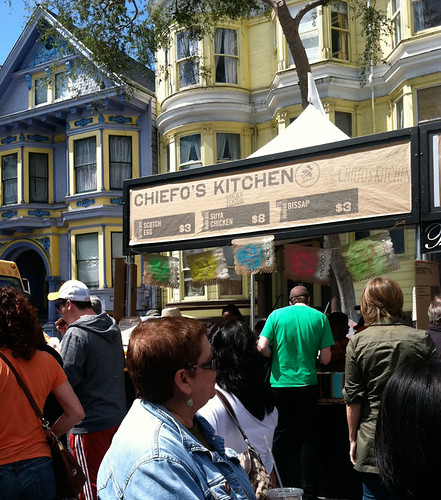
The only challenge about the Scotch Egg, made by Chiefo's Kitchen, is that it's not readily available. Sadly, Chiefo's Kitchen is not a restaurant, and their products are available at just Whole Foods Market on Franklin & California. When the owner, Chiefo Chukwudebe (who is lovely), worked an event at my Whole Foods Market location, I was able to tell her how much I adored her product and how it left a lasting impression with me. Perhaps with my enthusiasm, she'll expand her availability.
chiefos.jpg

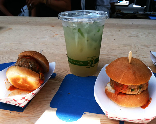
After the Scotch Egg, we happily consumed Meatball Sliders with a lovely and refreshing Ginger Mint Lemonade all from Beretta. The slider was tasty (the Scotch Egg was better), but the lemonade was simply delightful! Beretta gets the best drink award for the whole day. Perfectly executed.
meatball-sliders.jpg

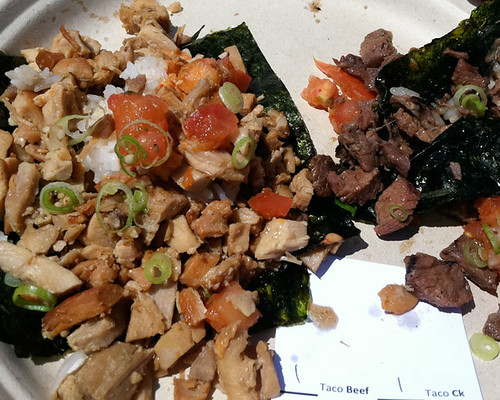
We then made our way down the street to seek the infamous Korean tacos, and we thankfully were able to compare two: Namu and Kung Fu Tacos. While Kung Fu had my heart with their whimsical branding (and Sriracha), Namu won out with flavor. We especially loved the seaweed wrapper, it added a nice salty dimension that the Kung Fu taco lacked.
namu-tacos.jpg

paceyourself.jpg
Very sound advice for the day.

One surprising disappointment was Il Carne Rosso.
ilcanerosso.jpg
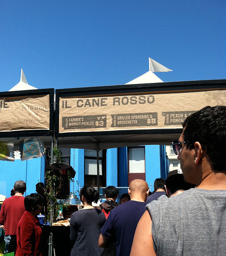
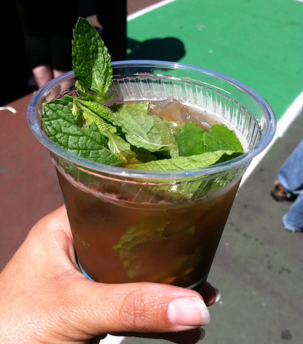
I adore their Ferry Building location, but was really unimpressed with the Peach & Ginger Porch Tea. It was essentially over-steeped peach tea stuffed with mint leaves and a few slivers of ginger on the bottom. From what I saw from other patrons, the Grilled Spareribs & Bruschetta was a pain to eat. I'm never a fan of dishes that are difficult or taxing to eat, especially in a festival setting. Again, I was surprised by such a big miss.
peach-tea.jpg

chavez.jpg
Cesar Chavez looking over us all with approval of our gluttony.

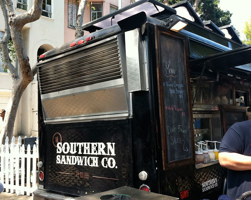
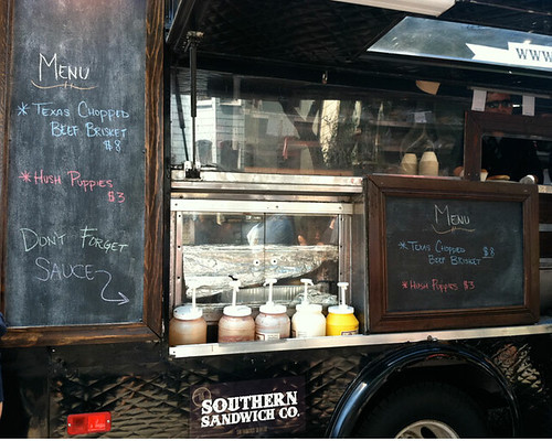
On a design side-note, I loved the style of the food truck by the Southern Sandwich Co. It had a rich, luxurious feel while staying casual and rustic. There was quilted metal on the exterior, big chalkboards with wooden frames, and the color was bold (especially compared to the others) and masculine. Loved it.
southernsand.jpg
souther-menu.jpg

Overall, it was a very successful, delicious day! I, of course wish I had more time and space in my belly to enjoy a few more dishes, but there's always next year! Thanks La Cocina.

::: end transmission :::

Monday, August 29, 2011

all signs point to los angeles.

During my very ambitious 30-day leave from work, I managed to make a quick trip to Los Angeles to see my pals, catch Renegade LA and to get inspired. One thing that I always marvel at when I go to LA is the wondrous signage all over the city. They've got hand-painted signs down for sure, even inspiring a typeface by Emigre called Los Feliz. I also love the vintage signage sprinkled downtown and in Hollywood. My most recent trip to LA revealed a lot of wit and charm that I don't often see in San Francisco signage.

Behold:
plug.jpg


sunsetjunction.jpg


where.jpg

heartnsoul.jpg

california.jpg
building.jpg
coles.jpg

colesmcrissy.jpg
I love everything about the branding and interiors of Coles. The French Dips were tasty (they claim to be the originals), but the horseradish was better (it's my motivation for the sandwich anyway). I adore the style of the awnings and the painted signage at the front door. 


Inside was haunting a dark, a perfect place for:hi-ball.jpg
BEST OLD FASHIONED EVER.
While the French Dip was tasty, the cocktails at Cole's were TO DIE FOR. Quite possibly the best I've ever had. That brandied cherry was really, well, the cherry on top. 


Thanks for having me Los Angeles!


::: end transmission :::

Friday, July 15, 2011

day one: Renegade.

Before I began my precious time off from work, I had intended to log every one of the 30 days on a daily basis. This, of course didn't go exactly according to plan, but I feel like the format allows for some flexibility.

Prepare yourself, as we will be traveling back and forth in time, visiting days past, hypothesizing the future and reporting as events unfold. No need to go in order, much like the creative process, we will be zigzagging.
renegade_overhead.jpg
It was serendipitous to find that the official start of my sabbatical coincided with Renegade Craft Fair here in San Francisco. What could be a better way to start a voyage fueled by creativity and guided by business, than a room full of my target market, my piers and some inspiration? A lot of that is my business class talking, but honestly, it was a rush to be amongst so many people who are as passionate and excited about craft as I am. Nibby Press will be there someday soon, and the experience of visiting Renegade and talking to the vendors, checking out the trends and booth setups, will be vital to our success. I don't deny that there are a lot of printers and crafters out there—Renegade (dauntingly) proves that, but my goal is to show a different approach to letterpress, and be smart with how Nibby Press grows. A big craft fair is a huge undertaking, and I want to be well-prepared when we get there.

I knew that photos wouldn't always be welcomed inside (with good reason since there's a lot of copycats out there), but since it was in the name of love and blogging, I snapped a few shots.

Most importantly, I ran into one of my business pals, Jackie Huang of Wool Buddy! Jackie is absolutely one of the nicest people I've ever met, and he's also one of the most talented. He makes wonderful felted wool toys and toy-making kits. His characters are so animated and endearing that they're magnetic! I'm so drawn to his octopus, that I had to take a photo with it.

sara_woolbuddy.jpg

The man himself: creator, owner & designer, Jackie Huang:
jackie.jpg

Buy your Wool Buddy today! Visit their online store or Etsy shop. I just purchased one of the kits for someone special, and I don't think it will disappoint! The adorable Wool Buddy table:
woolbuddy_close.jpg

Jackie's GENIUS credit card acceptance sign:
woolbuddy_cc.jpg

The free, mustache-optional Magnolia photobooth (with huge line, of course):
magnolia-photo.jpg

And the gorgeous view from Fort Mason:
view_fortmason.jpg

It's always a pleasure and a delight to visit Fort Mason, totally worth the trek. I'll follow-up with another post about the art-installation surrounding the building. It's an interesting take on "seating."
Stay tuned.


:::end transmission:::

day six // Just in time.

Stefan Sagmeister, one of my design heros, gave a most perfect speech at the Ted Conference in 2009 about the necessity of taking a sabbatical. He runs a serious design firm, highly sucessful, but he routinely closes the studio every 7 seven years for one whole year. I know, it seems a little Eat Pray Love of him (and he DID go to Bali), but it was all in the name of experimentation and discovery and future productivity. That's exactly where I'm at. And I've always wanted to go to Bali.


I happen to catch this just a few days ago, when I myself began an adventure of a 30 day-sabbatical from my day job to focus on Nibby Press. My purpose in these next 30 days are quite similar to Sagmeister's, but unfortunately I don't yet have his luxuries. He has one year in Bali, I have just 30 days in California. Each day off is precious, and somewhat of a risk, but watching this speech validates my instincts. I feel like I'm heading in the right direction. Thanks Stefan.


Saturday, July 2, 2011

At Last.

Our new logo and business cards are finally completed. Hooray!

We here at Nibby Press are pleased to offer a design that emphasizes texture and dimension, a representation of our future voyage.


Incidentally, while walking home from an event, I saw this curious door that reminded me very much of the biz cards:

Saturday, June 4, 2011

New Obsession.

The show Cosmos is my new favorite thing. Look how dreamy Carl Sagan is! I totally geek out for science, in any fashion, in any form. Watch this show, and you will not be disappointed—it's poetic and beautiful, it's thoughtful and challenging, and it's weird. I love it all, including Carl Sagan's hairline.

Wednesday, June 1, 2011

To quote.

Number 1: don't quit.
Number 2: listen to number 1.

—Duke Ellington

Monday, May 23, 2011

We're Working On It!

Stayed tuned for something new very soon.
It's all happening!