Sunday, August 26, 2012

Neil Armstrong: You Are Eternal.

photo courtesy of NASA
This weekend Neil Armstrong passed away at the age of 82—too young for a man who has been to the moon and back. It's no question that Armstrong will remain in American history forever, as a hero who flew a rocket amongst the stars and spoke so eloquently in the pinnacle of human triumph and emotion. I would have blown it.

Here's to you Neil Armstrong!

photo courtesy of NASA

Thursday, May 10, 2012

case study: commonwealth.


3menus.jpg

Recently my pal Ian Muntzert, Sous Chef of Commonwealth, was on the Food Network's game show, "Chopped." If you're unfamiliar, it's sort of an Iron Chef + Top Chef Quickfire hybrid. As expected, Ian was a fierce competitor, especially his (spoiler) third round dish. Watch the show, he's on the Viewer's Choice episode. They show a great montage of Ian in the restaurant, and of course the Commonwealth logo! Nice.

Watching the episode was also a reminder that I had not yet reported on the design + printing work I did for the restaurant. Therefore, welcome to Nibby Press' first case study: Commonwealth restaurant.

I was touched when Xelina Leyba, General Manager of Commonwealth (previously at Bar Tartine) approached me to create a design brief for the new restaurant's identity. Being a friend and fan of the Bar Tartine crew, I was very familiar with what I was getting myself into—their eminent success, amazing food and service to come—and the opportunity it gave Nibby Press.


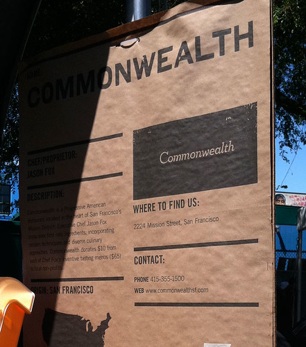
For those unfamiliar with Commonwealth, it's the brainchild of former members from Bar Tartine here in San Francisco, and a spin off of Mission Chinese, which is the brainchild of Anthony Mynt, also of 
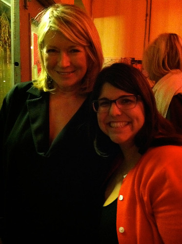
Mission Street Food fame. If you also can recall, Mission Chinese is where I met Martha, so it's kind of a big deal.

chef-closeup.jpg
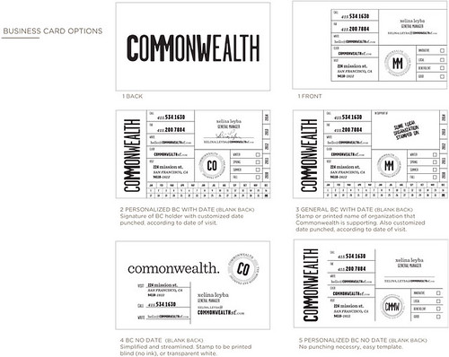
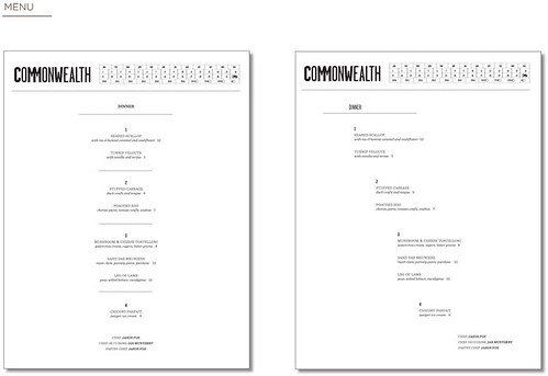
Commonwealth needed a logotype and secondary logo, four menus that could change frequently (daily), and a business card design for the restaurant and six partners. They had a draft of a logo from another firm, but were looking for something different.

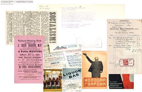
For a project of this magnitude, I happily immerse myself into the research phase and let everything that I discover guide the direction of the project. I started with 6 mood-boards and concepts, all drawing from the style of food, the location (The Mission), and the restaurant's benevolent nature. From my research and concepts, I created a more succinct mood board, and a small selection of logos, secondary logos, menus, business card designs and imagery for the client to choose from.

ROUND #1:
Socialist-chic; strong typography and hierarchy mixed with organic, handmade elements.

cmw-brief_concept.jpg

cmw-brief_logo.jpg

cmw-brief_bcoption.jpg

cmw-brief_menu2.jpg
cmw-brief_menu.jpg

cmw-brief_explorations.jpg

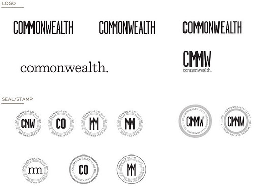
The initial direction didn't quite capture the ambiance of the restaurant-to-be, so I simplified the logotype and seal in the next round and introduced a filagree pattern to reference the generosity of the restaurant. The client wanted a "Co" ligature as a secondary logo to use for social media and any usage that required little space since the word "Commonwealth" is so long.

ROUND #2:
Evolution from Round #1, simplified and official.


cmw-brief_round3.jpg

cmw-brief_round3part2.jpg

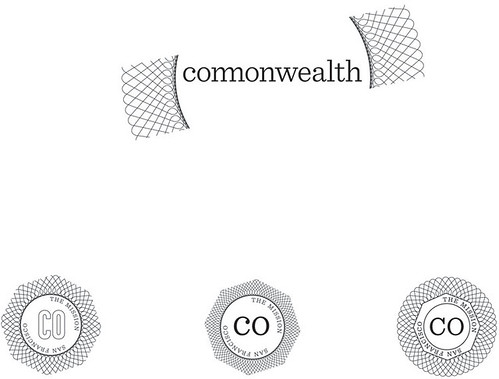
In the end, the client opted to revert back to the concept that they had initially, and the final design became a derivative of their initial logo but with a Nibby Press twist. I added a secondary graphic that represented a reciprocal reaction, a reference to Commonwealth's altruistic sensibilities and their practice of molecular gastronomy. The symbol is used all over Commonwealth's collateral.


cmw_logo-FINAL.jpg

3menus-other.jpg

bc-menus.jpg

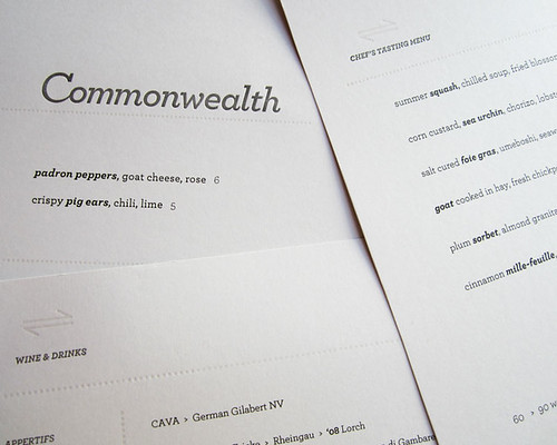
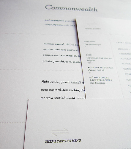
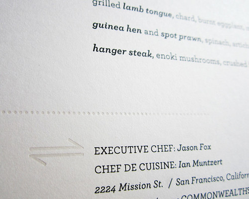
The initial round of menus were all letterpress printed—an idea that was romantic, at best. Underestimating the frequency and necessity of reprinting menus, we ran through menu stock three times faster than I had anticipated. After struggling to meet the demand of daily menu reprints, we abandoned the letterpress menu and now the remaining copies serve as exquisite artifacts from the opening of Commonwealth.   

lacocina-cmwsign.jpg
Booth at the 2011 La Cocina Food Festival

Thursday, April 26, 2012

mad + lovely.

32512madmen1.jpg
(Frank Ockenfels 3/AMC)
Now that Mad Men is in full swing, it's finally time to proclaim my total love and devotion for Season 5, but also share a wonderful artist who paints—you guess it—Mad Men!

To my delight, a friend picked up Caroline Wampole's enchanting business cards for me which offer a taste of Wampole's paintings that depict scenes from the iconic series. If I was in the market for some paintings, I would definitely pick up Wampole's "Red and Peggy in the Office" and "Rachel at the Tiki Bar." I absolutely adore the pattern and Rachel's striking profile. Gorgeous!

peggy-joan.jpg

lady.jpg
I've placed Caroline's business cards near my workspace for inspiration, but please visit her website for an interesting statement on her Mad Men series and contact information.


Tuesday, March 13, 2012

martha and me.

A few months ago I had the good fortune of dining at Mission Chinese Food the same night that Ms. Martha Stewart happened to be making an appearance. The thrill!

Martha & Sara

It was kismet.

My friend Jane and I had debated what night to eat at MCF, and we just so happened to choose the particular Friday that Martha Stewart had scheduled a dinner. As we were eating, chef Danny Bowein rushed by our table (part of the Commonwealth family), and I casually asked him, "How was Martha?" Being the Marthaphile that I am, I knew that he was recently on her show, and I just had to ask. He paused for a moment and disclosed, "She's coming in right now, about 10 minutes."

What the what?!?

Lady Martha arrived in her black stretch SUV with an entourage of about 15 gals and gays. They took a long table in the center of the tiny restaurant, and the champagne and chinese fusion cuisine began to flow. They dined for only about 35 minutes, and as fate would also have it, our table was perfectly situated next to the door, creating the perfect opportunity to introduce myself.

When she approached the door, I extended my hand, as if Adam to God in Michelangelo's Creation (too much?) and I said, "Martha."

I explained that since the age of 13, I'd been a fan, and I just needed one photo with her.

She agreed, but not surprisingly added, "Make it quick." When my friend Jane began to fumble the phone, my heart momentarily dropped and Martha began singing, "Hurry! Hurry!" but Jane recovered the phone just in time to snap this perfect shot.

Just how poised and perfect does she look? Lady M. knows how to work the camera. I, on the other hand, look like a goof. After our quick snap, she ran outside, took a few more photos and then was whisked away in her stretch.

It was beyond.

Sunday, February 26, 2012

precious and perfect

Why haven't I thought of this before? Ohio-based designer Adam Ladd of Ladd Design had his 5-year old daughter voice her opinions on some of the most famous brands and logos. It's fascinating! I love how she describes the McDonald's logo, and how familiar she is with coffee. Her perspective truly made me rethink a lot of these brands.

Take a listen:


Thanks to Brand New for the original posting.