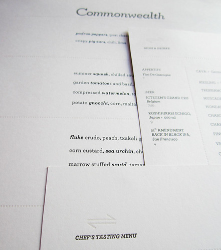
Recently my pal Ian Muntzert, Sous Chef of Commonwealth, was on the Food Network's game show, "Chopped." If you're unfamiliar, it's sort of an Iron Chef + Top Chef Quickfire hybrid. As expected, Ian was a fierce competitor, especially his (spoiler) third round dish. Watch the show, he's on the Viewer's Choice episode. They show a great montage of Ian in the restaurant, and of course the Commonwealth logo! Nice.
Watching the episode was also a reminder that I had not yet reported on the design + printing work I did for the restaurant. Therefore, welcome to Nibby Press' first case study: Commonwealth restaurant.
I was touched when Xelina Leyba, General Manager of Commonwealth (previously at Bar Tartine) approached me to create a design brief for the new restaurant's identity. Being a friend and fan of the Bar Tartine crew, I was very familiar with what I was getting myself into—their eminent success, amazing food and service to come—and the opportunity it gave Nibby Press.
For those unfamiliar with Commonwealth, it's the brainchild of former members from Bar Tartine here in San Francisco, and a spin off of Mission Chinese, which is the brainchild of Anthony Mynt, also of Mission Street Food fame. If you also can recall, Mission Chinese is where I met Martha, so it's kind of a big deal.
Commonwealth needed a logotype and secondary logo, four menus that could change frequently (daily), and a business card design for the restaurant and six partners. They had a draft of a logo from another firm, but were looking for something different.
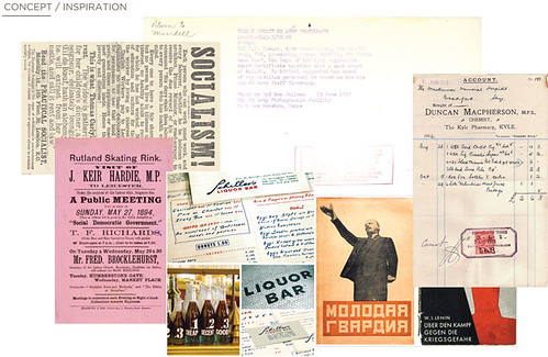
For a project of this magnitude, I happily immerse myself into the research phase and let everything that I discover guide the direction of the project. I started with 6 mood-boards and concepts, all drawing from the style of food, the location (The Mission), and the restaurant's benevolent nature. From my research and concepts, I created a more succinct mood board, and a small selection of logos, secondary logos, menus, business card designs and imagery for the client to choose from.
ROUND #1:
Socialist-chic; strong typography and hierarchy mixed with organic, handmade elements.
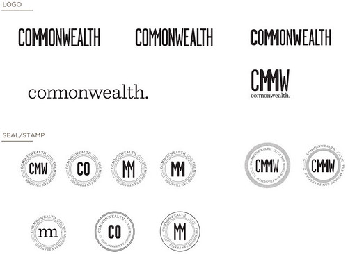
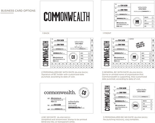

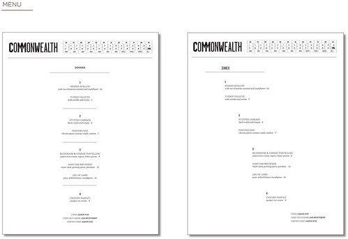

The initial direction didn't quite capture the ambiance of the restaurant-to-be, so I simplified the logotype and seal in the next round and introduced a filagree pattern to reference the generosity of the restaurant. The client wanted a "Co" ligature as a secondary logo to use for social media and any usage that required little space since the word "Commonwealth" is so long.
ROUND #2:
Evolution from Round #1, simplified and official.

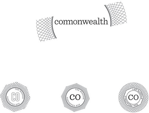
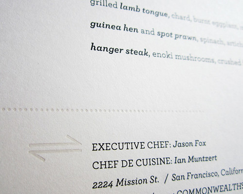
In the end, the client opted to revert back to the concept that they had initially, and the final design became a derivative of their initial logo but with a Nibby Press twist. I added a secondary graphic that represented a reciprocal reaction, a reference to Commonwealth's altruistic sensibilities and their practice of molecular gastronomy. The symbol is used all over Commonwealth's collateral.

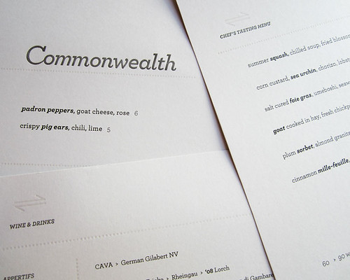

The initial round of menus were all letterpress printed—an idea that was romantic, at best. Underestimating the frequency and necessity of reprinting menus, we ran through menu stock three times faster than I had anticipated. After struggling to meet the demand of daily menu reprints, we abandoned the letterpress menu and now the remaining copies serve as exquisite artifacts from the opening of Commonwealth.
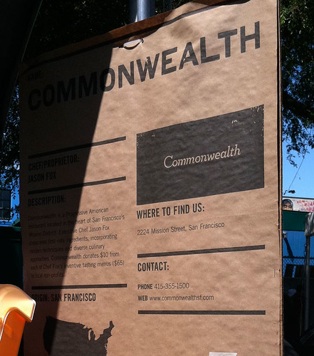 |
| Booth at the 2011 La Cocina Food Festival |


