
I just saw a Trix commercial that ended with a cute girl saying to this awkward guy, "I love blogging!" Then they walked away together, presumably off into the sunset.
Touche, Trix.
Monday, June 29, 2009
Sunday, June 28, 2009
22 Days.
I'm actually kind of shocked that it's been 22 days since my last post, but I've had a few recent distractions. What compelled me today was this image:

Like many, I have conflicted feelings about MJ, but this image really evokes a lot of happy memories for me. I can't remember how many times I listened to Thriller in the car with my whole family (it was one of the few tapes that my parents would approve), and I remember spending hours in our living room, working on my lean. Oh how I wanted to lean like him!
Thank you MJ, for at least getting me to try it at 45 degrees.
Saturday, June 6, 2009
Yes, Please.
My latest obsession: 
Painted wooden chalkboard by Ben Floeter. Comes with one piece of chalk and measures 15.25" x 7.25". Has two pre-drilled holes in back for mounting onto your wall.
Available at the Curiosity Shoppe.
It's beyond.
Takes only second to my first obsession:

ROCK BAND.

Painted wooden chalkboard by Ben Floeter. Comes with one piece of chalk and measures 15.25" x 7.25". Has two pre-drilled holes in back for mounting onto your wall.
Available at the Curiosity Shoppe.
It's beyond.
Takes only second to my first obsession:
ROCK BAND.
Friday, June 5, 2009
In The Midst.
Currently inspiring Nibby:
 Purkinje Neurons


 Purkinje Neurons
 Dmitry Sarkisov GS
Department of Physics Princeton University
Department of Physics Princeton University
This is a composite image of five Purkinje neurons from the rat cerebellum, in the back of the brain. Each has been filled with fluorescent dye through a glass pipette, shown touching the cells. Images were taken on a two-photon microscope. Each Purkinje cell receives hundreds of thousands of inputs through its dendrite, the elaborate tree-like structure seen emerging from the cell body.


Mouse Retinal Ganglion Cell
Daniel O'Shea '09 (undergraduate)
Department of Electrical Engineering
Daniel O'Shea '09 (undergraduate)
Department of Electrical Engineering
This is a GFP-tagged mouse retinal ganglion cell (in green), overlaid on a layer of cells with DAPI-stained nuclei (in blue) and ChAT-stained starburst amacrine cells (in red), taken with a tri-channel confocal fluorescence microscope.


Thursday, June 4, 2009

What a Tease.
I just received the latest Anthropologie catalog, and low and behold, the issue was designed in collaboration with Hatch Show Print! It's like Anthropologie is writing love letters directly to me. You already have me, Anthro, you already have me.
You can tell it's Hatch Show from a mile away from the very graphic design, and the colorful and bold wood type with lots of layering and texture. Look how gorgeous this cover is:

And the back cover, with that classic wood type lockup:

I love wood type and the variety and texture it creates, but I've never been totally interested in using it in my own work. It would be a constant battle of letting in too much influence from HSP.
It's interesting what's going on with studios like Hatch Show Print and Hammerpress, where their work, originally designed to be screenprinted or letterpress printed, is being offered to the masses in offset form. Although the original printing techniques elevate the work, the designs still hold in their derivative form. It's a coo to the solid design, but I'm not sure how I feel about these recreations. Sure, it makes the work more accessible with fast production, but to me, that defeats the purpose of letterpress. I love that each piece that I print is slightly different, essentially making them one-of-a-kind.
Of course, if Chronicle Books knocked on my door, asking me to lend them some designs for their gift line, I might sing a different tune.
Tuesday, June 2, 2009
Hmmmm...
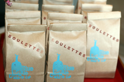
I'm not sure if I'm complaining, or just making an observation, but it appears that my worst/best fear has come true: Blue Bottle Coffee is taking over the city. I am near-obsessed with Blue Bottle Coffee, but each expansion has riddled me with feelings of both jubilation and apprehension. Of course I'm thrilled that it'll be increasingly easier to get my coffee here, since more locations equals greater convenience and wider disbursement of customers, possibly making each store a little less busy. But then, there's potential for the quality to go down; there's something a little obnoxious about the growth; and now it's not so much a secret society, with which you were an active member of. They only have 4.5 locations in the city, 6.5 on Saturdays, so it's nothing crazy. Although, anyone who knows about La Boulange, may sort of understand the "obnoxious" factor about rapid growth. It just makes me wonder about how Starbucks began, one store at a time, and then two stores at a time, and then...
Anyhoo, I'm going to go get some coffee.
Fortified.
Even though I'm a member of SFMOMA, I hadn't been paying attention to the exhibitions, and it took two recommendations from friends and the pressure of the final show date to get it together and see the William Kentridge exhibit. As I entered the show, I immediately felt a wave of regret, knowing that I would need at least five more days to absorb the breathtaking work; a combination of drawings, paintings, video installations, an opera, and a mechanical puppet show that left me speechless. The work was so accessible, and soulful, and heavy, and just exquisite. As a woman who sat at my table in the museum cafe said, "We are now fortified."
Truly.
I particularly loved his work on book pages, which is something that I've been working with as well, and hope to integrate into the packaging of Nibby. Here are some highlights (I'll have more once I get the exhibition catalog):


I would advise everyone I know to run and see the show, but Sunday was sadly the last day.
Subscribe to:
Posts (Atom)


